
Description
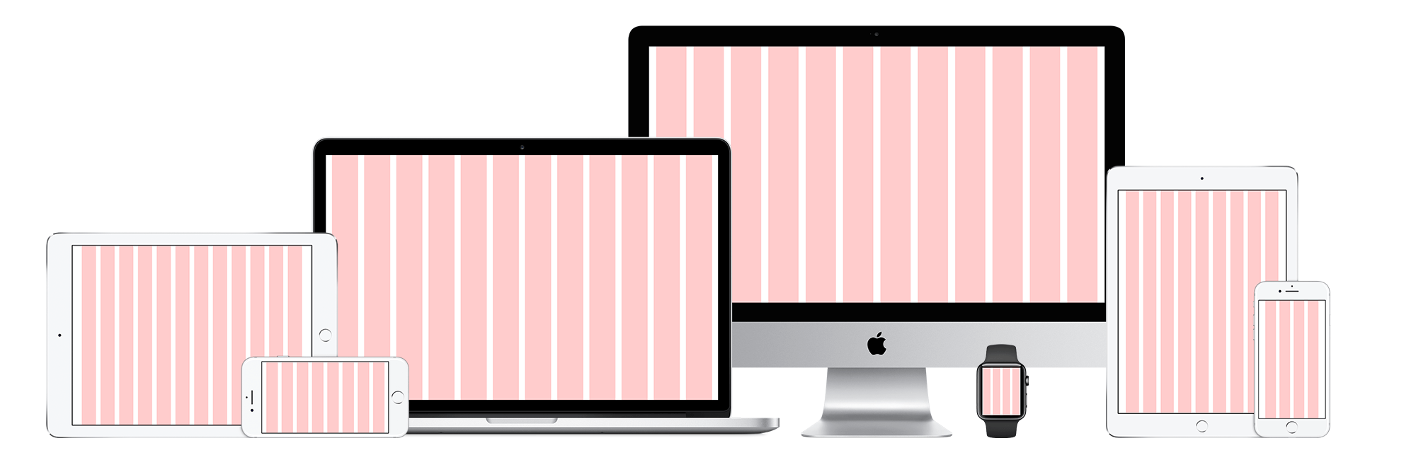
Our complete grid system collection includes templates for desktop, tablet, mobile, and even wearables like the Apple Watch. In our latest release of this grid system set, we’ve included support for the most recent Apple products – Apple Watch Series 8, iPad Pro, and iPhone 14. All and all this set includes templates for:
Desktop
- 960px – 12 Columns
- 1280px – 16 Columns
- 1440px – XX Columns
- 1600px – XX Columns
Tablet
- iPad Landscape – 12 Columns
- iPad Portrait – 9 Columns
Wearable
- Apple Watch 42mm Series 1 & 2 – 4 Columns
- Apple Watch 38mm Series 1 & 2 – 3 Columns
Mobile
- iPhone 7 Plus, 6S Plus, & 6 Plus Landscape – 9 Columns
- iPhone 7 Plus, 6S Plus, & 6 Plus Portrait – 5 Columns
- iPhone 7, 6S, 6, & 7 Plus/6S Plus/6 Plus (Display Zoom) Landscape – 8 Columns
- iPhone 7, 6S, 6, & 7 Plus/6S Plus/6 Plus (Display Zoom) Portrait – 4 Columns
- iPhone 7/6S/6 (Display Zoom), 5S, 5C, 5, & iPod Touch 6G, 5G Landscape – 7 Columns
- iPhone 7/6S/6 (Display Zoom), 5S, 5C, 5, & iPod Touch 6G, 5G Portrait – 4 Columns
- iPhone 4S, 4, 3GS, 3G, 1st Gen & iPod Touch 1G-4G Landscape – 6 Columns
- iPhone 4S, 4, 3GS, 3G, 1st Gen & iPod Touch 1G-4G Portrait – 4 Columns
Note to Designers
All of our stencils are based on this amazing grid system so this is a must have if you use any of our other products and want to our stencils to be perfectly interchangeable. Also, if you’re a perfectionist and want more details on our grid system here are some nitty gritty specs:
- Our grid system uses a consistent 60px (45pt) column width, 20px (15pt) gutter width and varying margin widths based on the device type.
- Our 1280px grid layout is 1280 x 720px which is ¼ scale resolution of the iMac Retina 5k Display (5120 x 2880px) and is ½ scale resolution of the Apple Thunderbolt Monitor (2560 x 1440px).
- The iPad grid system is 1024 x 768px which is full scale resolution of the iPad, iPad 2, and iPad Mini. Additionally, 1024 x 768px is ½ scale resolution (2028x1536px) for the iPad Air, iPad Air 2, iPad Mini 2, iPad Mini 3.
- The iPhone 7 and 7 Plus is 1/3 the size of the rendered pixels of 1242 x 2208px which is downsampled by x1.15 of the physical pixels of 1080×1920.
- The iPhone 7 and 7 Plus in Display Zoom Mode is 1/3 the size of the rendered pixels of 1125 x 2001px which is downsampled by x0.96 of the physical pixels of 1080 x 1920px.
- The iPhone 7 is 1/2 the size of the rendered pixels of 750 x 1334px.
- Our Visio template uses an 11 x 17in tabloid-page format.
About Grid Systems
Grid systems have been used in print publications for decades, but with their introduction into web, world is relatively new but is a standard nowadays due to the popularity of many CSS frameworks that have grids built-in.
Grid systems allow elements to be precisely aligned to columns which can help your site feel more structured and reduce visual chaos. It helps your users find and navigate through information.
Using a grid system in your designs is a great way to achieve a level of consistency that would be otherwise extremely difficult to obtain. Grids create a consistent layout for your site, which in turn builds the cornerstone for usability and structural harmony in your site.
Grids allow you to quickly add elements to a layout because many layout decisions are addressed while building the grid structure.
Aesthetically, designing along a grid can be very visually pleasing at the visceral level.
Plus, If you’re working with a team – visual designers and front-end developers will thank you because your designs will already be built using a grid system so your wireframes won’t get shuffled around when they ultimately get converted into a grid system.
Product Compatibility
The Responsive Grid System Collection is compatible with the following applications:
Figma
Please visit our Support Page for detailed specifications regarding application version compatibility.